APPEARANCE OF A LIGHTINGDESIGN
Nederlandse Versie
Without refering to the premisses of lightdesigning, it is important to look at the different parts of which a lightingdesign should consist. A complete lightingdesign consists of the following parts:
possibly completed with a Magical Sheet and/or a colour- and spotlist, in wich the amount and the sort of colour gels and spots is written down.
 The lighting plan consists of one schematic drawing, at least made on an A3-size paper, where in topview is shown how the setting of the performance is, and where the spotlights should be hung. The setting is representend schematically, the spotlight are represented bij standard symbols. In the Netherlands they are the so-called DIN-symbols, where DIN stands for "Deutsche Industrie Norm". The spotsymbols are always placed within the space of the theatre as it is marked in the drawing. When necessary it is also possible to give a side- or frontview, in which cases the lightingplan consists of two or three drawings. The colours that are being used are placed in front of the spotsymbols, just before the lenses, in which the claled for colours are used. When no colours are being used it is marked by the letters "O/W" in front of the spotsymbol, where O/W stands for "Open/White". The lightingplan makes it possible for a technician to put hte spotlights into there right places. The more exact the measurements of the plan are, the less explanation a technician needs to perform his work. Off course a lightingplan should also have a legend, in which it says what kind of symbols are being used, and an extra part for more information about the performance and the designer. Apart from that the brand of the colourgels used should be indicated as well.
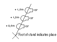 When using several spotlights on a stand the symbols would have to be drawn on top of each other in a top-view. In a top-view they would be seen exactly in the same place. There are two ways to solve this problem: when there are a lot of spotlights that should be hung on the same heigth it is possible to make a cross-section plan at that height, to make clear that all the spotlights in that cross-section should be placed on that height. In thos cases a lightingplan can consist of several top-views. We can see this espescially with lightingdesigns for the bigger theatres, where there are several layers where the spotlights are hung. When a stand is being used a designer might also choose for a more or less twisted representation of the stand to make it possible to show all the spotlights used on the stand. Important is that the bottomcross, being used to indicate the bottomside of hte stand, shows where the stand with its spotlights is placed. In such a case the spotsymbols itself do not indicate the exact position of the lights, in contradiction with the normal way they represented the positions.
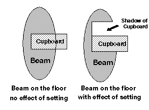 The focuslist almost always consists of several drawings. Only within very simple lightingdesigns it is possible to find one drawing for the focuslist. The several drawings of the focuslist indicate how the beams of the spotlights used would look like when they would hit the floor. The beams are drawn as if there is no setting standing in their way, so that they are not hindered by any objects. This is to prevent that the beams drawn become to complicated, when having to give notion to the way the beam hits the setting. The drawings are in top-view, just as the lightingplan is. When a beam does not hit the floor, not looking at the setting, but for instance a wall, it is not shown in the focuslist. When necessary an extra side- or frontview can be given, to show how the beams of those spotlights should be focused. There should always be a grid on the drawing, no matter which view is given. Normally the chosen size of the grid is 1 by 1 metres, to make it as easy as possible to focus the spotlights in the theatre.
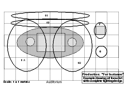 It is important when making a cuelist that each beam can be seen seperately; one should therefor never draw to many bundels crossing each other. That is why a focuslist always consists of several drawings. The beams are drawn in random order, the only things that counts are the sizes and shapes of the beams on the floor. There is no reason to arrange them in scenes or cues, important is that alle the beams are drawn in as less drawings as possible. But one should keep in mind that the entire focuslist should be easy to read. For that reason the beams should never be coloured in, only the boundaries of the beams are shown. When colouring in the beams the visibility of the beams becomes less very easily. Via numbers the beams are linked with the spotsymbols in the lighting plan to make clear which beam belongs to which spotlight. When there are several spotsymbols with the same number, for instance when they are connected to the same channel or dimmer, letters next to the numbers are used to make a clear seperation between those spotlights. For that reason one might run into an "1A" and an "1B" in focuslist and lightingplan. The drawings of a focuslist are alwas made on A4-size papers. This is a good size to handle where everything can be seen very well. With help of the focuslist all the spotlights, that are hung with the help of the lightingplan, can be focus by the technician without to much extra explanation.
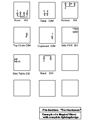 Besides the lightingplan and the drawings of the focuslist sometimes one finds a Magical Sheet as well within the lightingdesign. In the Netherlands this is not usual yet, in the United States it is very common. When working out a complete lightingdesign it is recommendable to make a magical sheet, this might save a lot of time when the design is performed in the theatre. The magical sheet is always made on one A4-size paper and consists of several squares, in which there are arrows drawn with numbers. Below the bottomside of the square stands a short line as a remembrance to the use of the lights represented in the square. These squares represent schematically the entire stage or theatre, whatever is needed. The spotlights of the design are represented by the arrows. All arrows are always within the boundaries of the squares, so each square stands on its own. At the bottom side left is given a short explanation, on the right the colourgel used in those spotlights is shown. Spotlights with different colourgels can therefor never be found within the same square. The way the arrows are put together is random, they certainly do not have to be arranged in scenes. Often this is even impossible, as often there are used different colourgels in a scene. Every spotlight is represented only once in the magical sheet by an arrow, once the spotlight is represented, it can not be foud again in a different square.
With a complete lightingdesign there should also be a cuelist. The cuelist represents the different brightnesses of the spotlights used in each scene. For every lightimage there is therefor a list, which looks a bit like a fishbone. Up front the Masterfader is represented by the letter "M", and it is usual set to 100 %. When a spot is set to 100 % it is usually indicated by the letters "FF" or also "FL". This is done for reason of 'characterplaces': 100 consists of three characterplaces, the 1, the 0 and another 0. All other values from 01 to 99 consist only of two characterplaces. When using computers it is important for the available space how many characterspaces are used. It is a difference of one characterplace, but when using several channels it easily makes a difference of one or two lines on the computerscreen. For a good insight of what is happening on stage it is important to get as much information as possible on the screen. And that one characterplace per channel might just be the difference between a clear view or not.
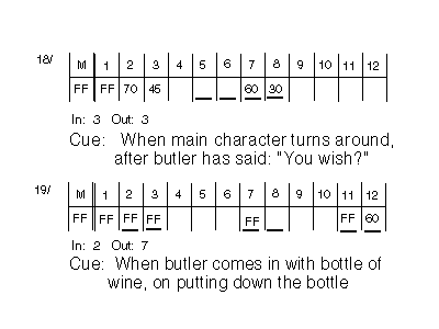 On the topside of the fishbone the different numbers used for the spotlights in lightingplan, focuslist and magical sheet are indicated. The bottomside shows in percentages how bright the spotlight is burning in that particular lightimage. Two values are represented in a different way: 100 % is represented by FF, 0 % will not be indicated, a blank field appears on those places. Changes in values compared to the former cue is shown by a drawn line in the new cue under the percentage that goes with the number of that channel. That way one can easily see which channels have changed in value, and should therefor get some extra attention in the new lightimmage. Beneath the fishbone two other things are indicated: the time in which the new cue "comes in": in, and the time the former cue needs to "get out": out. Times are always represented in seconds, a crossfade of two minutes shows an in- and out-time of "120" (seconds). These two times indicate how the crossfade from one cue to another is made. The times for the crossfade are always shown at the bottom of the new cue.
Finally beneath the times it is indicate at what point in the performance the new lightimage should come in, the so-called "cue". Normally this is a subscription of the situation that can be seen on stage at that point of time. For every situation where intensities of spotlights do change, which is: for every new lightimage, a new cue has to be made. The cuelist starts with the "audience-cue", the lightimage the audience will see when coming in to the auditorium. The meaning of this image is to "heat up" the audience already a bit, to get them into the atmosphere of the performance. The final cue should ne the "exit-cue", and is meant to "give" the audience something to "take home" with them. Often the last lightimage represents the general atmosphere of the performance. All cues together, from "audience-cue" to "exit-cue" form together the cuelist.
Sometimes one can also find a list with the lightingdesign that shows the amounts of colourgels used, and possibly the amount and type of spotlights used. This list can help the theatres where the lightingdesign is performed to check whether they have all the equipment asked for, but do not improve the overview of the lightingdesign.